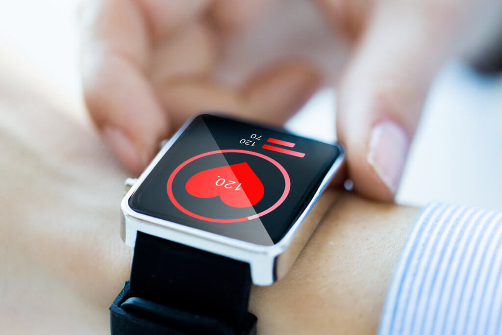
5 Essential Design Tips for Wearables
April 29, 2021 - 8 minutes read Wearable devices have consistently penetrated the consumer market over the past several years. Globally, the number of connected wearables is expected to grow to more than one billion by 2022. For wearables development companies, like San Francisco-based Fitbit and Apple, the competition has only grown recently with the introduction of more wearables options from companies like Garmin, Kate Spade, and Fossil.
Not only have the competitors grown, but the types of wearables are also expanding from smartwatches to rings, glasses, and even clothing. Designing for wearables presents its own set of challenges, limitations, and use cases. In this first post of our wearables design series, we’ll go over five design tips that are crucial to wearables UI and UX design.
1. Prioritize Contextual Design
Wearables are considered “smart” because they can understand the context and actions to take within a certain context. For example, if you’ve started recording a run, your smartwatch should know that you will probably want to play music and pause or fast-forward songs while in motion. Smart devices have a lot of movement and motion sensors that you can utilize to develop a contextually intelligent UI.

When designing contextually, you’ll want to research and analyze your users, their environment, distractions, goals, and subtasks to make the perfect UI. By designing for context, you enhance your user’s experience greatly.
2. Make it Easy to Understand at a Glance
When you design for context, you’re going to want to ensure that many of the options available to the user are easy to access and understand at a glance. For example, while you’re tracking your daily run, you don’t need to be inundated with the weather, traffic patterns for your commute, or even your reading list. You simply need a few options, like music, workout settings, and phone and messaging capabilities.
Glanceability is what many wearables designers aspire to have their UI reach, and it refers to designing information for short bursts of interaction. This can include lights on the outside of the device, a large confirmation that something worked, or simply less engagement needed to get a task done. Because wearables that have screens often have limited real estate, the screen should prioritize the most important information.
According to health app development experts, a user should be able to quickly understand the screen’s contents. How quick, exactly? Less than 5 seconds.
3. Limit Interaction Requirements
Wearables are often purchased to ease a person’s stress and worries. While desktop and mobile apps measure their user engagement in minutes or hours, a wearable user may only interact with it for half a minute. This is intentional: wearable interactions should be as short as possible out of the box. If a user needs to interact with your app for more than 10 seconds, you’ll need to optimize the design and user experience.
The music-finding app Shazam does a great job of keeping interaction limited. It requires the user to press the app to open it, press the large Shazam logo (usually the only thing on the screen), and wait for Shazam to match the song and return the name. Apple’s messaging app also keeps interactions limited by offering pre-defined responses to text messages and a voice-enabled response system, rather than a tiny keyboard to type up a custom response.
4. KISS!
This is a well-known design principle for designers across every medium, whether that’s print or digital. But keeping it simple is easier said than done, especially in the wearables arena where screen space is severely limited. It may come down to eliminating more information from the screen than you’re comfortable with, but don’t let it reduce any functionality or cheapen the user experience.
A good approach to keeping it simple might be to focus on each use case and design a user flow for it before moving on to the next use case. This way, it will keep the interface minimal, information glanceable, and options contextually relevant. It may also require you to break up a simple task into multiple windows or screens so the user feels like you’re walking them through the process.
5. Keep it Minimal
Minimalism is a trend that we’ve abided by on digital interfaces for the past few decades. While the small details are always in flux, for example, drop shadows, border thickness, and positioning of main elements, the idea is still the same: to keep the interface easy to understand, easily readable, and easy to interact with.
Don’t forego the minimum design guidelines for minimalism. For example, you’ll still need sharp contrast to make things easily readable. For small screens especially, contrast is key to the variety of environments your users will be subjecting to their wearables.
Typography is still a major design foundation, and on wearables, typography needs to be simple and easy to read. Nothing fancy or modern is needed, and even a familiar font like Times New Roman can get the job done well.
Spacing through margin and padding is still extremely important. Too little space and people with larger thumbs will get frustrated. Too much space and something important could be overlooked easily. Finding a balance with element spacing is crucial, and keeping it consistent should go without saying.
Design for Humans, Not Computers
When you design for human eyes and brains, it takes longer because of user research and feedback, but the result is a highly optimized app that can deliver the most delightful user experience. Designing is difficult and, if done right, is thankless, but it’s critical to every part of the wearable: the user, interface, and even the device itself. Stay tuned for our next post that will cover more design principles for wearables.
What’s your favorite part of your wearable? Do you have a favorite app that makes things easier for you as a user? Let us know in the comments below!
Tags: app developers san francisco, eHealth app development San Francisco, medical app developer, MedTech app developers San Francisco, mobile app developer San Francisco, mobile app development San Francisco, San Francisco app developers, San Francisco eHealth app developer, San Francisco MedTech app developers, San Francisco mobile app developer, San Francisco tech, San Francisco wearables


