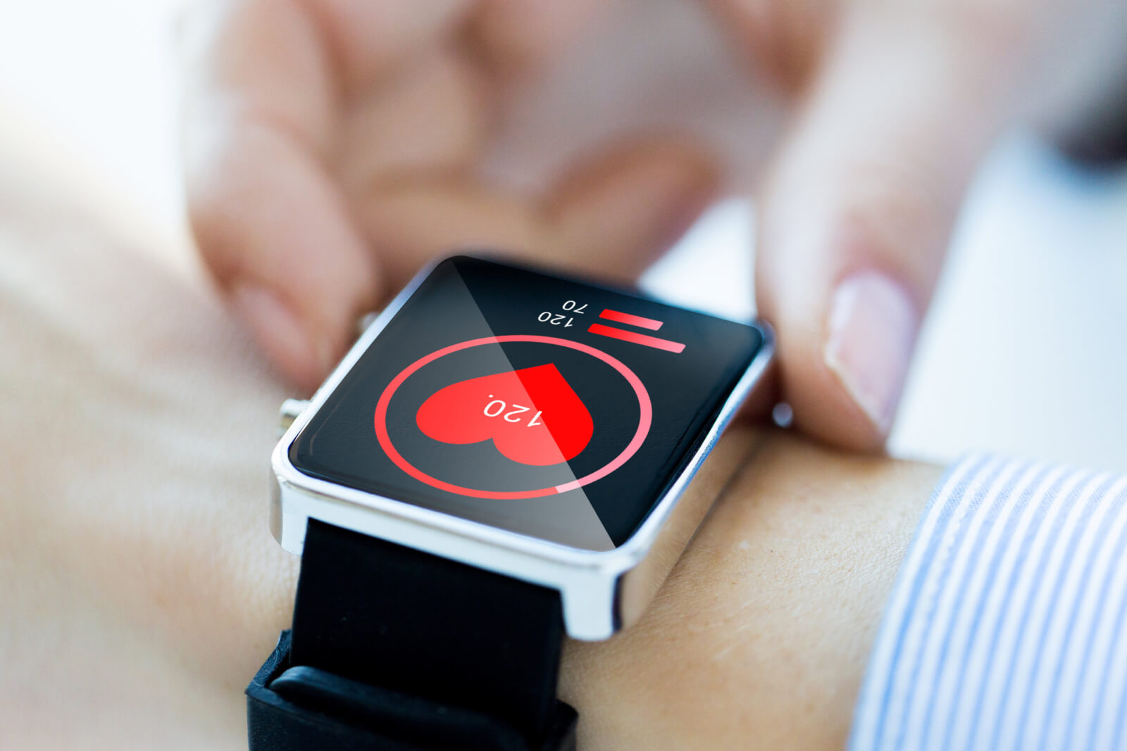
 Wearables are everywhere, and they’re moving past the usual smartwatch territory into new areas, like clothing, glasses, and rings. Although all wearables connect to your mobile device for a more detailed experience, we’ve come to expect a lot from the user interface (UI) and user experience (UX) of wearable screens. For health app developers that focus on fitness and wellness as part of their tracking, creating an attractive and useable interface will be key in keeping users engaged with and consistent in using their wearable.
In our last post, we discussed UI-based design tips to integrate into your wearables interface, and in this post of the series, we’ll cover some UX-focused design guidelines.
1. Check What’s Viable
Before overhauling any designs or interface components, try to gain an understanding of what’s possible and viable. Your chosen tech stack may not make it easy to develop new ideas, and the platform you use may come with limitations that restrict your full range of possibilities. Research what the software development kit makes possible, and know what the device can measure with its current hardware. If you make the mistake of skipping this crucial step, you’re going to be disappointed when you realize that the idea can’t be implemented until new hardware is released, a new tech stack is used, or is just not possible at the moment.
2. Minimize Interruption
Keeping users engaged requires commanding their attention periodically and in a focused way. When the interface shows a long list of notifications, shows unimportant notifications to the user in real-time, and alerts the user to non-urgent items, the user can become overwhelmed. Over time, the user can stop engaging with the wearable completely and never put it back on. These users may never use their wearable again or swear off of purchasing any new type of wearable in the future.
To mitigate a drop in users, reduce how many notifications the user is subjected to every day. The information sent in the notification should be minimal, and the user should be prompted to edit what kinds of notifications they receive when they first set up the device. In case the user skips this part of the onboarding process, they should be able to edit their preferences later on from an easy-to-find location. Notifications should also be sent infrequently.
When the device does send a notification, it should contain valuable information for the user. It may be worth building a feature into your wearable that tracks what notifications are swiped away the most and what notifications and clicked into the most. From there, you can prompt the user to edit their notifications in the accompanying mobile app or desktop app. Like we mentioned in the last post, contextuality and relevance are crucial to the user experience, and notifications are already a big component of the user experience.
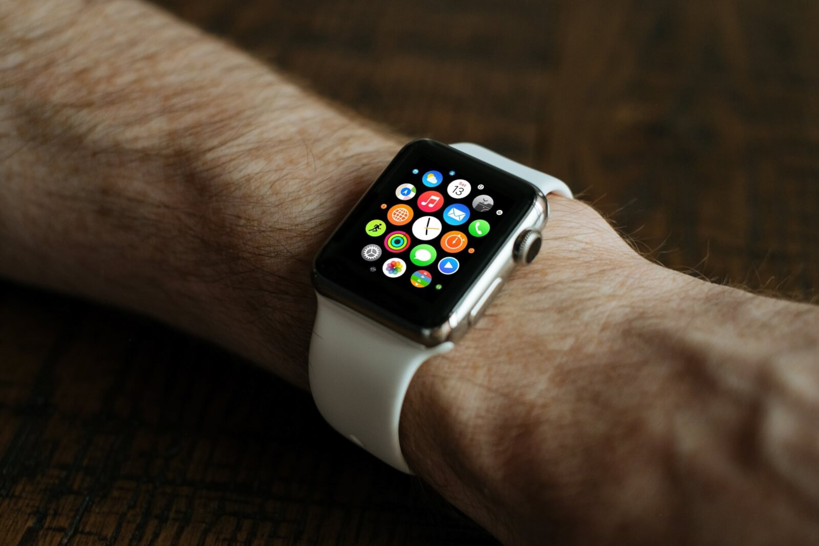
Users should also be able to set how they want their notifications to alert them. Whether it’s silent or full of vibrations and screen glows, give the user the power to manage their preferences.
3. Opt For More Privacy
Wearables often don’t have a password enabled because the user is usually wearing the device on their body, making it difficult to lose, forget, or get stolen. As a result, confidential and personal information can be seen by others. Whereas smartphones mostly stay in a pocket or purse, a wearable screen can be seen by anyone.
If possible, build more privacy options into the UI for users. For example, display content according to the direction the wearable is facing. If your developers can figure out the angle when the user is looking at the device, rather than letting the device hang with their arm, you can add more privacy into the wearable. Another way to incorporate privacy into a wearable UI is to vibrate first and then display the notification, allowing the user to quickly look at the wearable screen before someone else does.
4. Design for Offline Usage
These days, optimizing an application for offline usage isn’t out of the ordinary. With more options than ever to build offline capabilities and sync the data later, there’s no reason why wearables should lack this feature. Wearables, like any other device, will experience Internet connection problems, and preparing for this possibility ahead of time can set your wearable apart from its competitors. At the very least, there should be text displayed that explains to the user why they can’t interact with some portions of their wearable.
5. Interaction With Other Devices Is Important
The Internet of Things isn’t just for industrial applications anymore. Connecting your wearable to other devices, like the Alexa, the Nest doorbell, a thermostat, and even a washing machine is a great way to stand out and attract more home-based users. Integrating the wearable into the user’s digital ecosystem can create more value for the user, which in turn can create a loyal engaged user. One example of this is the Fitbit app that shows much more detail than the smartwatch about the user’s fitness goals, daily habits, and tips to improve wellbeing. San Francisco-based Apple also shows more detail in their mobile apps than their Watch does, particularly for health and fitness metrics.
6. Leverage Non-Visual User Interface
With wearables, the user should feel as if the device is both there and not there. The difference in acknowledgment depends on the context of the situation, and wearables offer multiple ways to get in touch with their users. For example, there is not only touch but also vibration and sound to utilize for various needs.

The Wearables of Tomorrow
Wearables are becoming more ubiquitous. Although we expect their feature sets to grow over time, we also expect their UI and UX to improve greatly over time. You may not think it’s true, but a wearable can be unforgettable depending on how well or how badly it accomplishes contextual awareness, notification frequency, and integration with other devices.
Have you encountered a wearable app with a bad UI or UX? What stood out to you about the experience? Let us know in the comments below!


