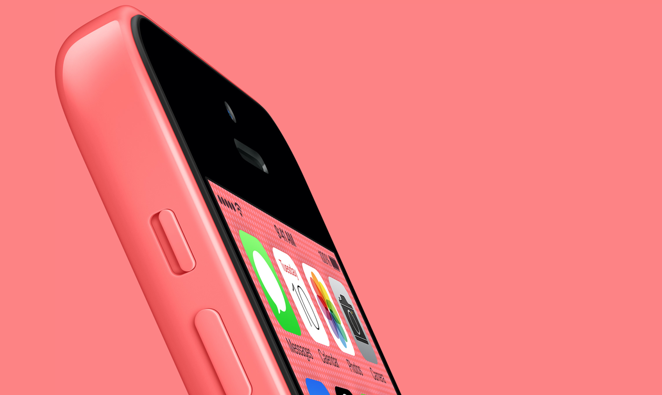
Look at a 2004 BlackBerry. Now look at an iPhone 6. Smartphone design sure has come a long way, hasn’t it? For iPhone app developers, there’s never been a better time to design mobile products — yet many iPhone apps aren’t nearly as polished and refined as the platform itself. Startup founders know the competition is fierce, but the high bar is actually set by the highly-polished iOS interface as much as the other apps in the Apple App Store.
Design matters, and it’s at the heart of everything that happens at Apple. While some NYC iPhone app development companies partition design to a predetermined timeframe early in the product development process, Apple specifically avoids setting concrete start and end dates to design. Products are fluid, and the needs of a particular product — be it an interface, iOS, app, or iPhone — can quickly change between iterations, even late in the design process.
Says Alan Dye, vice president of UI design at Apple, “We want the way you use our products to feel inevitable.“ According to Dye, ”inevitable” is a word that comes up a lot in the company’s design process. After all, the Apple’s wild success is rooted in the primary difference between the initial iMac offering and the more prevalent Microsoft alternative; one felt natural while the other felt complex. (We think you can guess which one felt natural.) Successful apps like SnapChat and FaceBook follow a similar process, setting design and usability at center-stage throughout the product development process.
New developments in 3D touch are poised to change the mobile landscape dramatically in the next couple years. With the inner logic of iOS and Android operating systems becoming much more related to the logic of how users interact with real-world objects, creating products that feel “inevitable” is more important than ever before. Does you startup’s mobile app feel like a fluid extension of the iPhone platform, or like a desktop app crammed onto a small screen? The answer is in the metrics; iPhone app development companies that take design as seriously as Apple themselves will see their apps stand the test of time while flimsier, less-considered products go the way of the dinosaur.


