Kirb
The one-tap parking app
Built for iOS

“The team is very involved, not just in the development of the software, but also with the business and market strategy aspects. It was a no-brainer to choose them.”

The Challenge
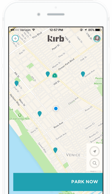
18+ million people living in greater Los Angeles, the largest commuter city in the country, public parking is a royal pain in the butt. Meanwhile, many residents and business alike have untapped real estate sitting dormant every day. Until now. Kirb is a mobile application that allows users to book parking in advance, from a few hours to a full day, avoiding the hassle of circling the block. It’s also a great way for residents and business owners to make some passive, ancillary income.
The Process
Cuyler had lived in Tokyo and New York for years as a consultant, so he experienced the pain of parking (or lack thereof) first-hand. He saw an opportunity in the dormant real estate of privately owned spaces, and we saw an opportunity to support him beyond simply developing an app. So we helped secure his initial round of funding through our network of angel investors.

A space to innovate
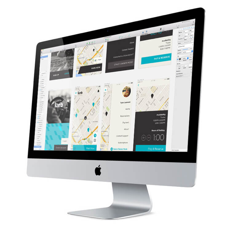
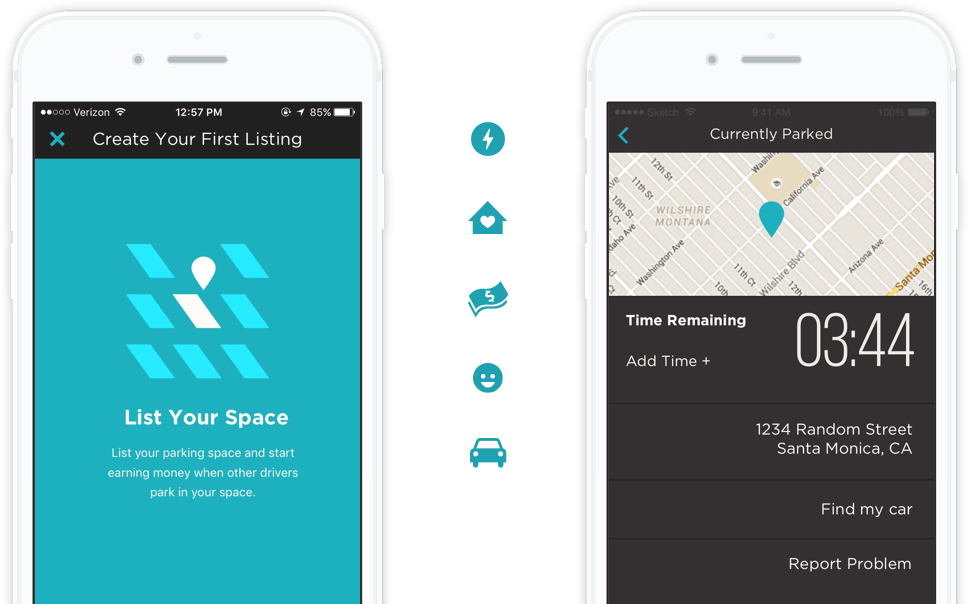
Moving forward, it was imperative that we design an intuitive user interface that those on both ends (users in search of parking spots and those who had them) could easily understand and enjoy interacting with. Our UX team also worked diligently to ensure that users can easily upload new parking spots and cash out earnings at any point via PayPal and Venmo. On the flip side, parkers can book a spot in a single click and remotely add more time to their space without needing to return to their car. In addition to the app, we also helped develop Kirb’s website.

“Dogtown brought a lot of insightful market and environmental research to the table. They defined our concept and goals better and were able to make a better project because of their management and ideas.”

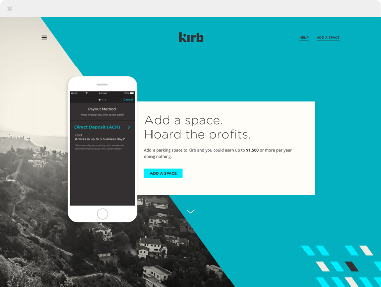
Website
We built a website to help promote the launch of the app. And we helped with copywriting and brand positioning throughout the design phase.
