Design is daunting and difficult; it takes a lot of effort to make something look and feel seamless. And in the current (and competitive) mobile app landscape, you can’t afford to skimp out on a beautiful user interface and experience. At this point, a seamless UI and UX is the minimum needed for mobile app success. Don’t disappoint users who download your app – design your mobile app right the first time.
If you’re not sure how to effectively and correctly design a mobile app, we’ve compiled a list of tips from the mobile app developers and designers in our Los Angeles-based office. Check it out!
#1: Plan ahead
Take the extra time and effort to wireframe, write rough copy, and revise everything in iterative steps. When you think you’re done, go back and minimize areas where users can get confused, frustrated, or cornered into a part of the app with no way of going back.
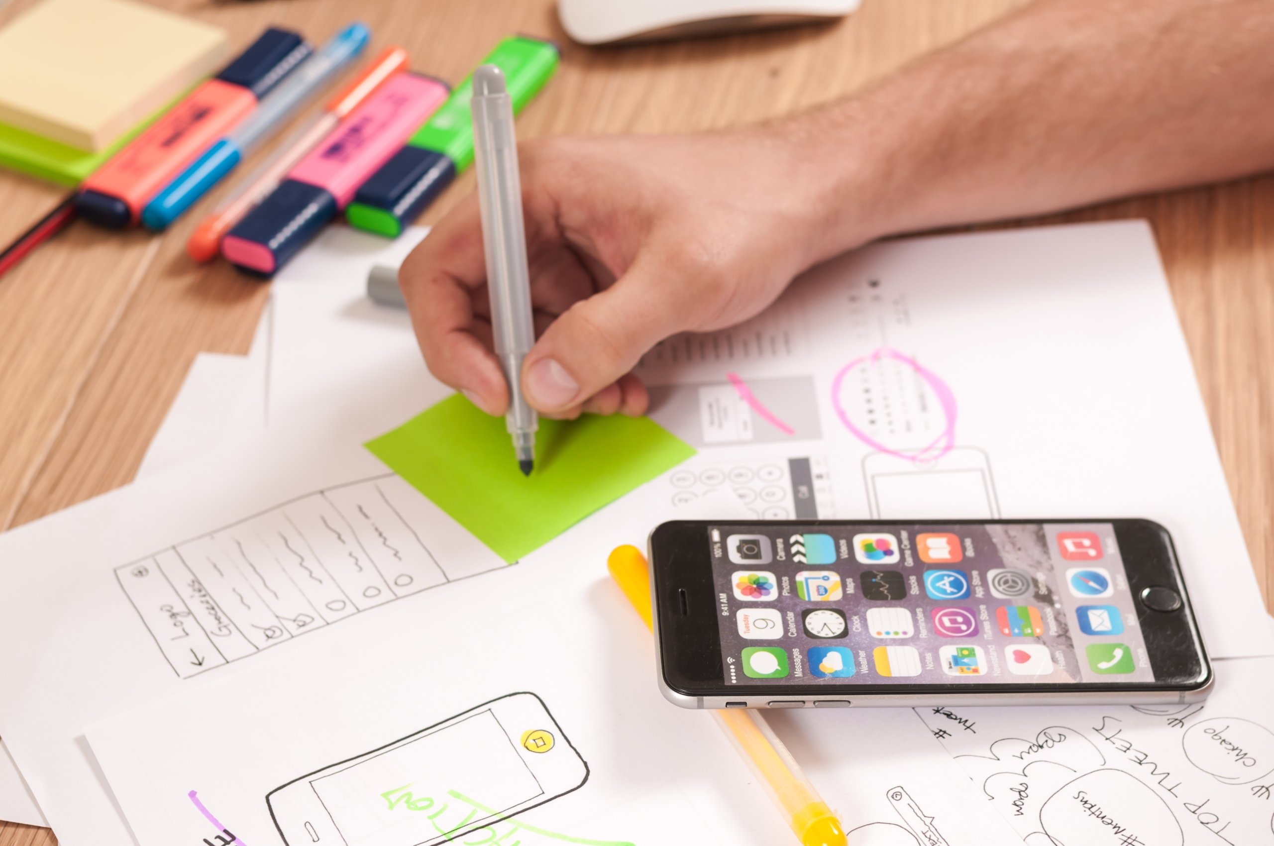
This is a great time to plan for what (if any) animations and gestures you want to incorporate into the design. Starting this conversation early can lead to many follow-up discussions with the rest of the team. It’s important to remember that any extra features, like animations, should remain intuitive for the user, both in their placement and their purpose.
Including a member from every team involved can also speed things up; if a developer is able to confirm whether something is possible on the back-end, the wireframe iterations will move along faster.
Visualizing the “big picture” ahead of time can be difficult and sound daunting, but it ultimately saves more time, budget, and effort for everyone. A project that may take six months without proper planning can take half the time when developers are given exact instructions to build upon. This also reduces internal back-and-forth and the risk of miscommunication between teams.
Lastly, does your client already have established brand guidelines and a style guide? This can take care of a lot of the initial legwork for you in helping define styles, color palettes, icon sets, fonts, and much more.
For all of this planning, your users will thank you by reporting fewer bugs and more compliments.
#2: Stick to a proven formula
But don’t be afraid to improve on that formula with each project you take on. Did your last mobile app require an extra side-step off of your current checklist? Add it in for future projects so you’re not doing any work twice!
Start with goals for your app, its users, and the business. List them out explicitly. You’ll want to return to these later when the project is getting more complex and involved. Use this list to keep yourself and the rest of the stakeholders and teams aligned.
When you think things are straying, remind everyone what was agreed upon at the beginning of the project. If needed, revise this list moving forward, but you will find that this list stays concrete for most projects. Goals do not usually change, but be prepared for small tweaks.
Remember, your proven formula will not be exactly the same as your competitors’ proven formulas. And that’s okay – you’re bringing a unique twist to this project, so don’t be afraid to let it show.
#3: Think of your users at every step
Does the client have their current user base and ideal user base mapped out? Who are you designing for and who might use the app in the future? User stories, complete with their problems, how your client helps solve their problem, how the user is acquired, and more, flesh out several users for you to envision throughout the design process.
The design process isn’t straight-forward, but neither are your users’ needs. If you can imagine yourself as the user of your new app, you’ll avoid most major pitfalls and areas of frustration from the get-go. Anything remaining (and minor) can be adjusted after launch. Doing this throughout the design and development process shows in the final product — often, these mobile apps are very obviously thoughtful and fun to interact with.
Move up your project’s timeline for all teams by a few weeks. Then ask everyone to spend the last few weeks interacting with the app, submitting bugs, adding more hand-holding instructions, and cleaning up anything left behind in the rush to launch. Go through the goals you wrote out at the beginning of the design process — are they being met? If not, how can you meet them?
Research shows that humans love positive reinforcement (come on, did we really need to do official research on that?). Did the user successfully check out their cart? Let them know with a small celebratory animation. Did the user clear their whole cart? Give them a way to undo that action, and let them know it’s okay. Meanwhile, maybe it’s a good time to check out how many users are clearing their carts and undoing the action; perhaps the “clear cart” button is in an area that’s too easily accessible?
Keep it up
As we mentioned many times, designing is an iterative process. By the end of the project, you might be completely bored of staring at the same wireframes. But the fire will come back when the wireframes are transformed into a real app. And that’s what keeps us going as mobile developers and designers.
Keep up your design eye by following your competitors, and leave some room in your design process for creativity and ideation. You’ll be surprised at what you’re capable of creating!


